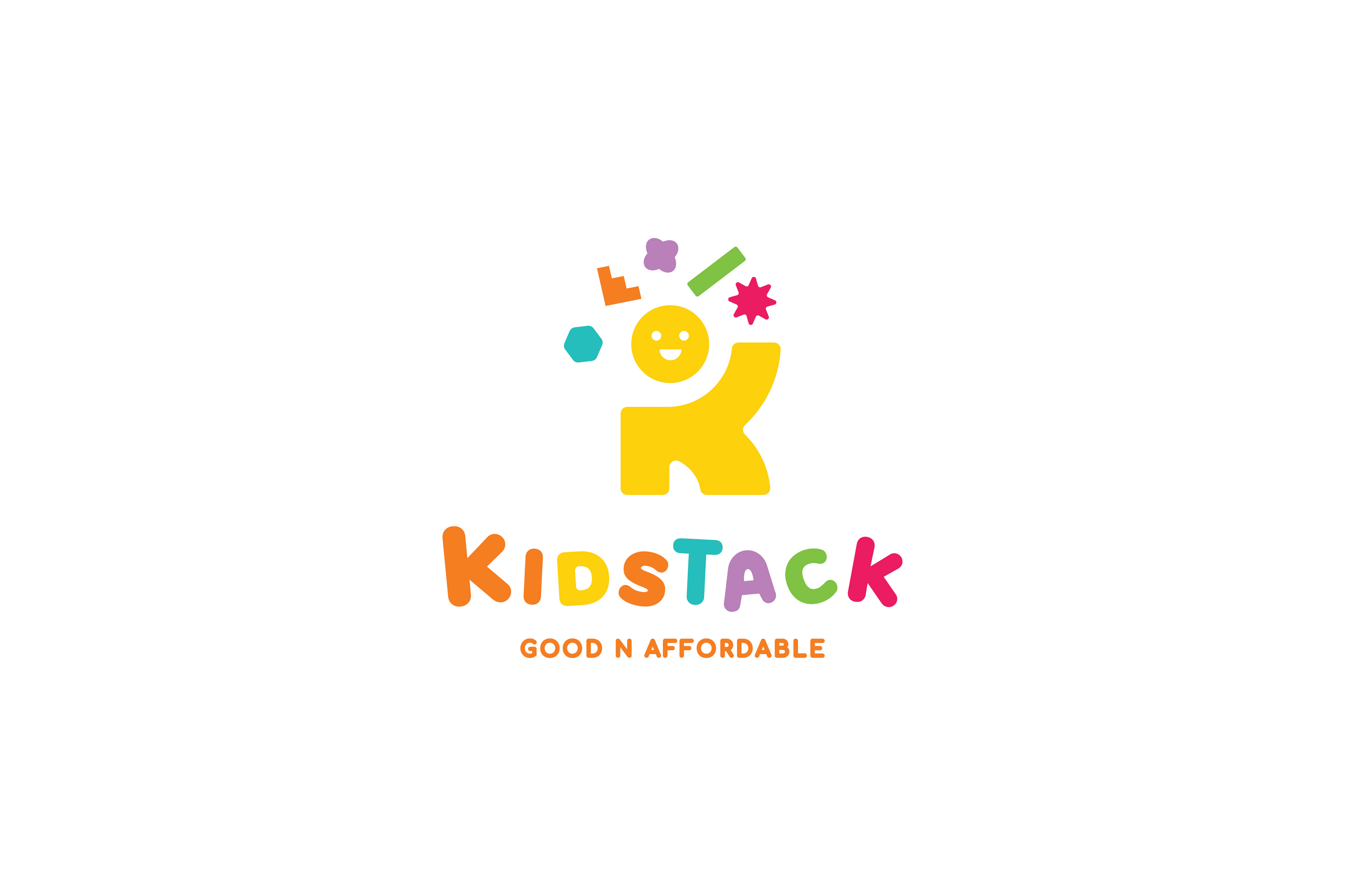
Concept Development
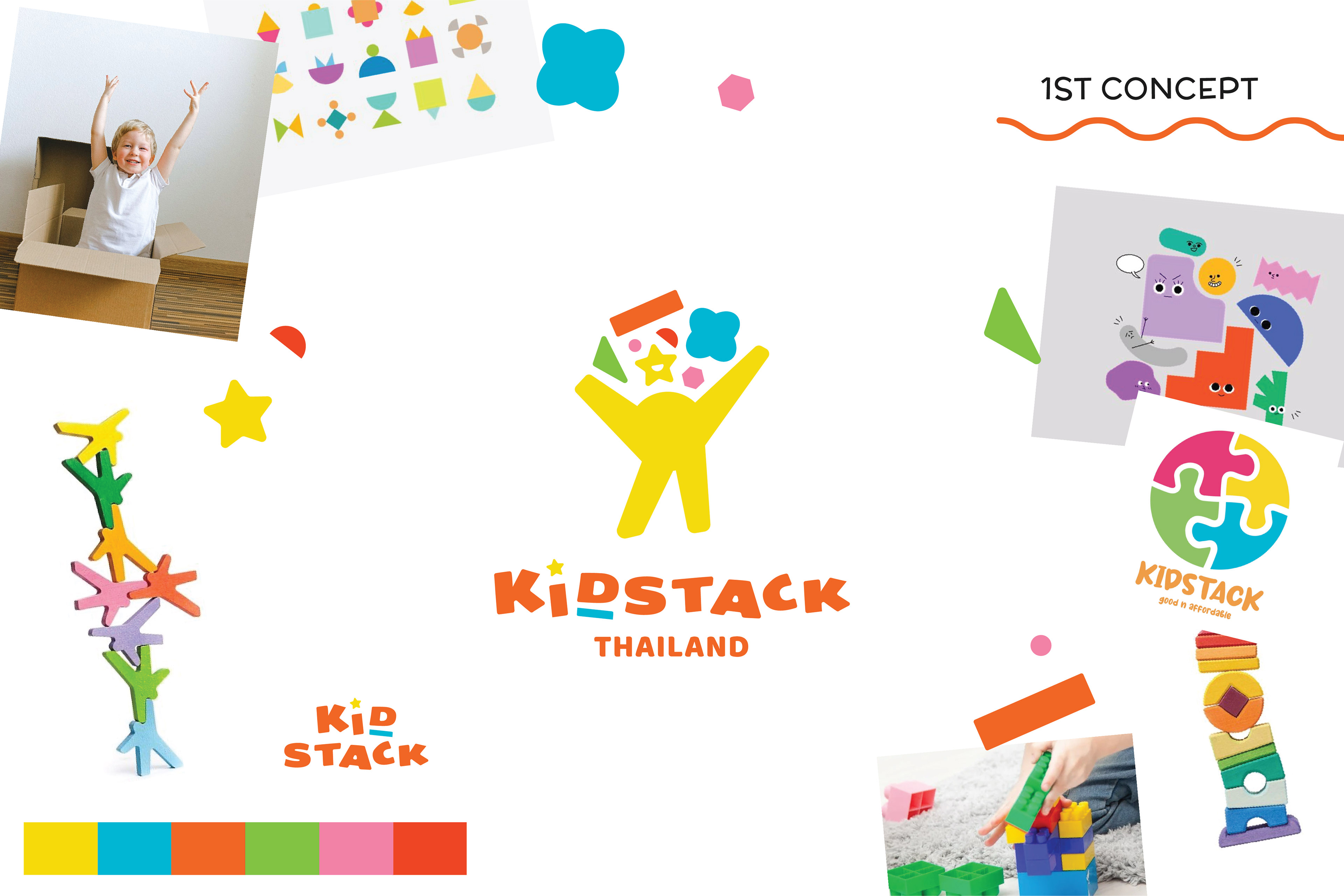

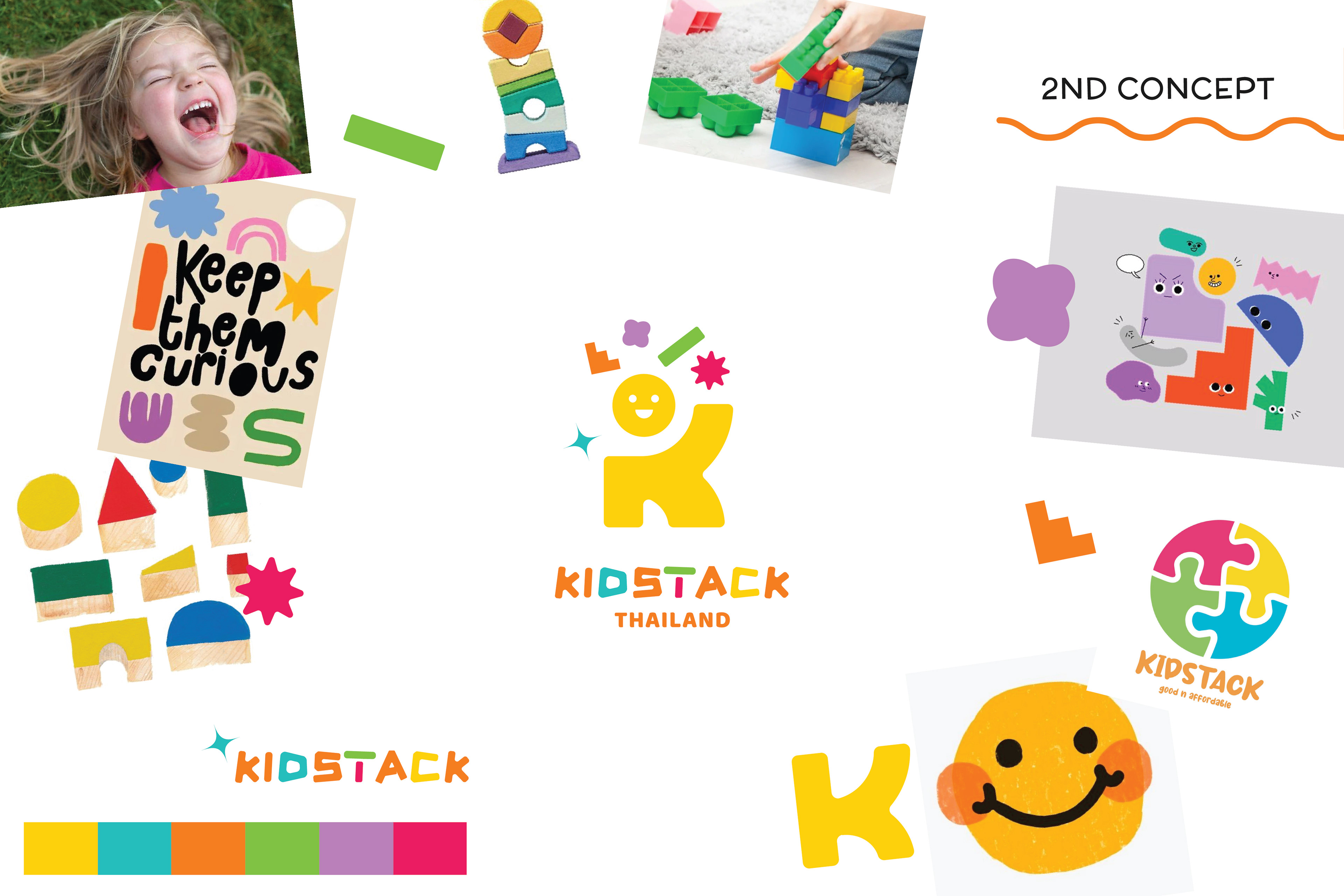

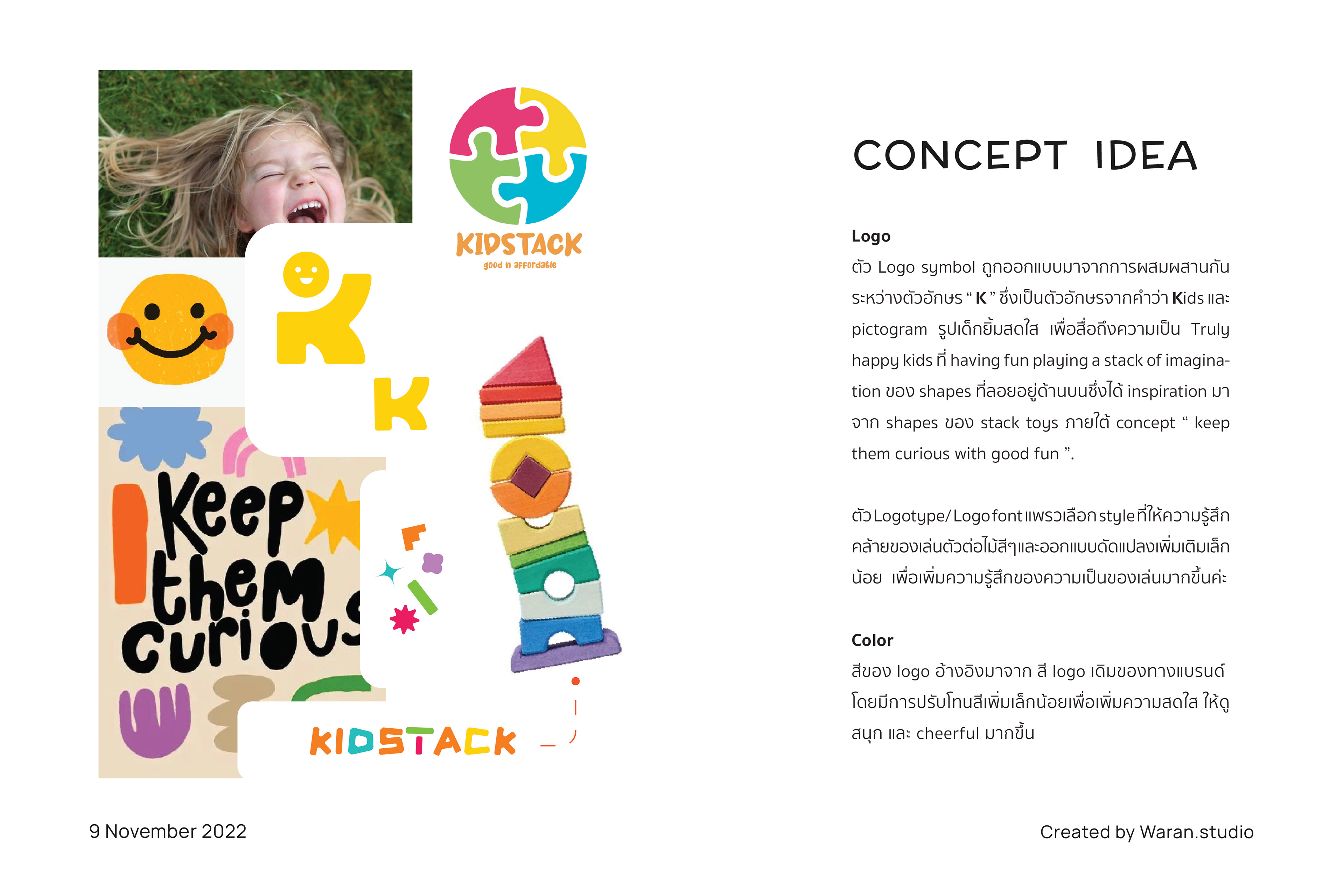

Kidstack is a kid toy brand based in Phuket, Thailand. They have their mission to not only providing fun with toys but also care about the kids' development, making it possible to every imagination of joy. From the brief, the client wanted a redesign of their previous logo with the concept as mentioned above, that still keeps the same color palette style from the previous logo. The client wants to provide a good vibe of cheerfulness and kids-friendliness for their brand.
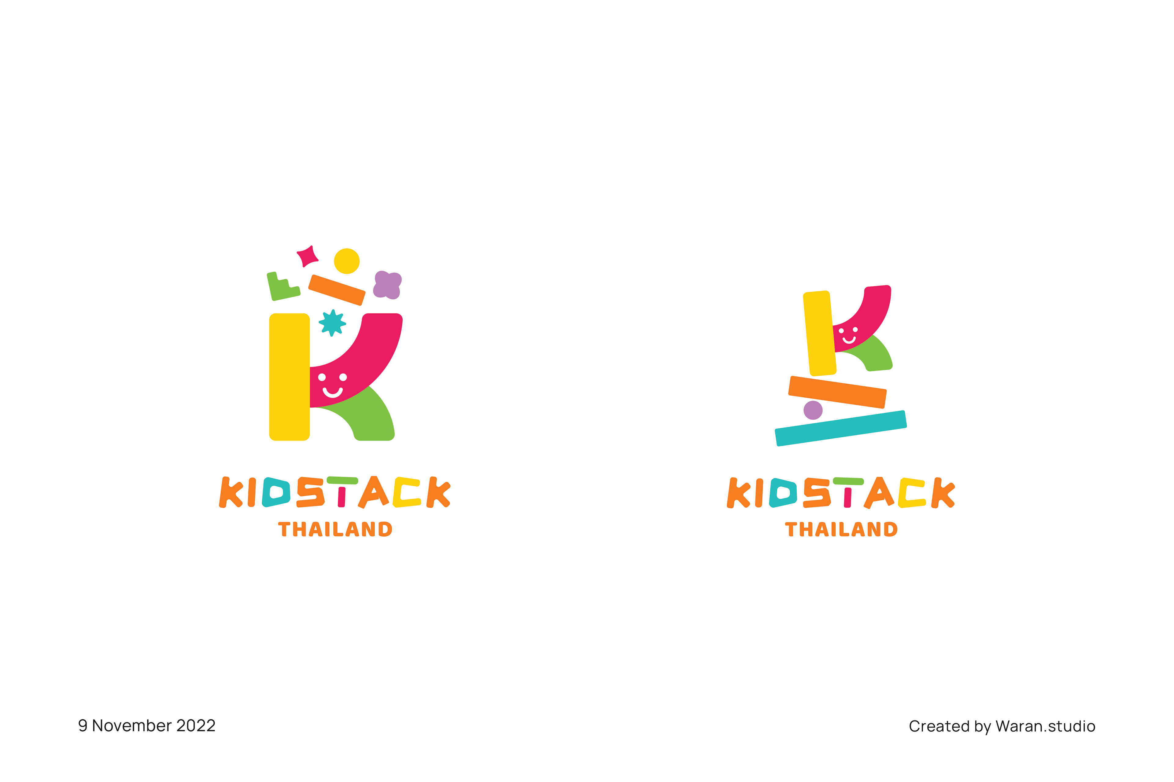
Design Concept
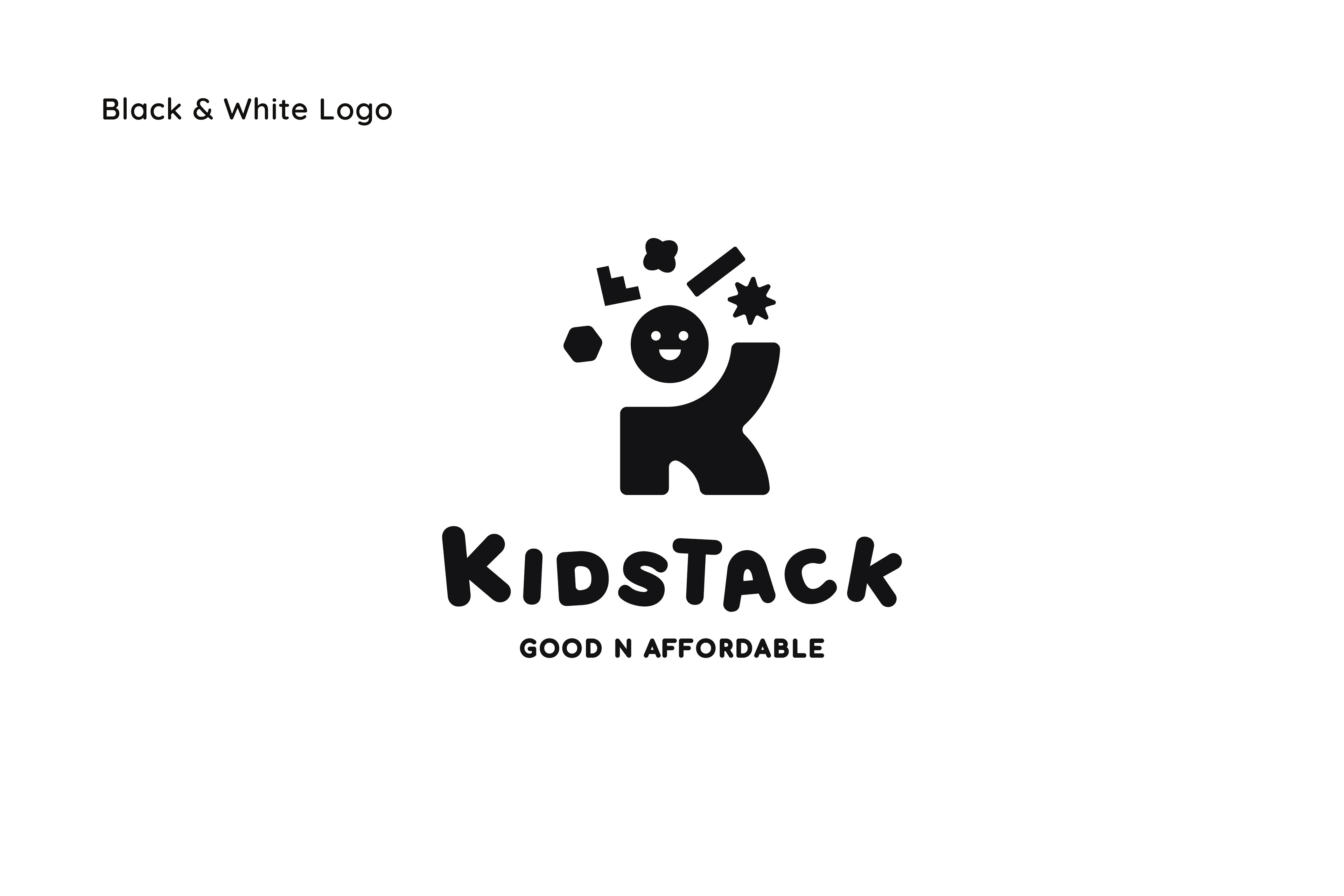
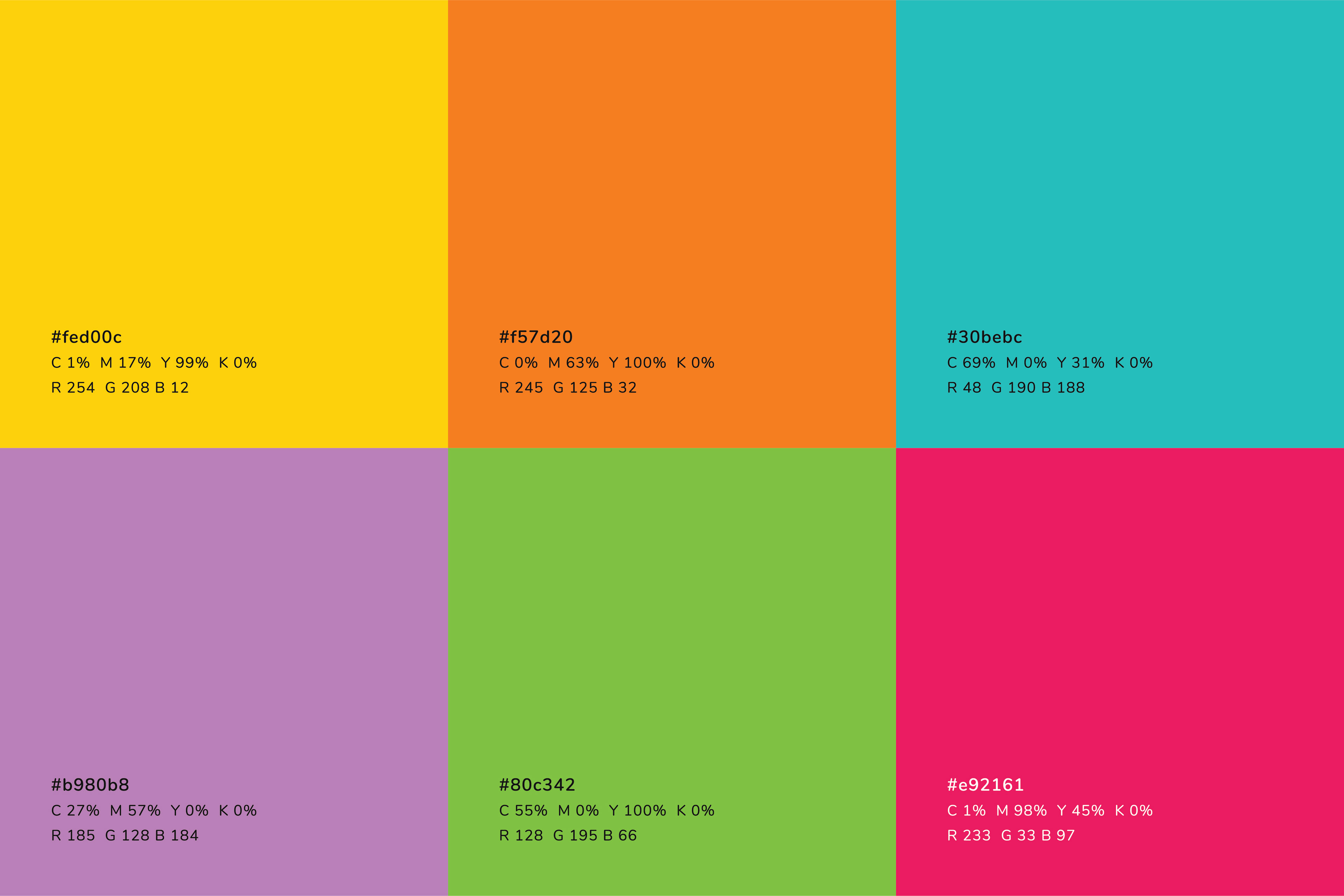
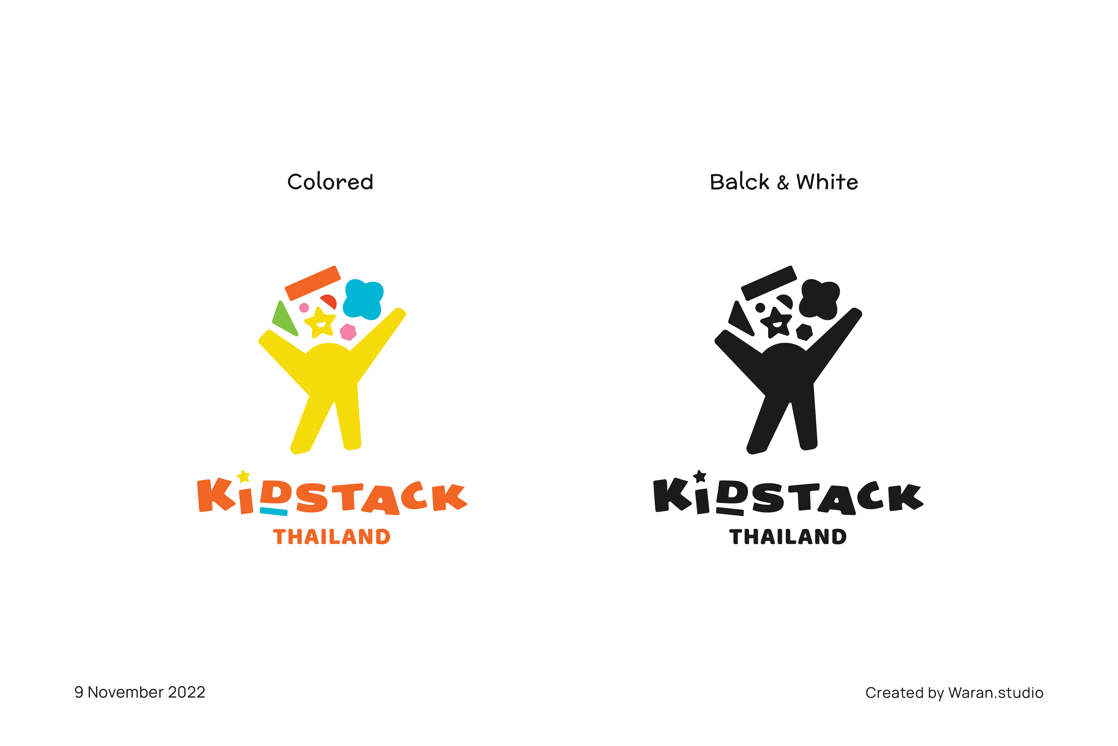
The logo was designed based on the shape of letter " K ". The " K " actually refers to the first letter of the word " Kidstack " that I found could be presented as a signature of the brand's name. The logo symbol also presents the action of a happy cheerful kid with free imagination of creativity, presented by different shapes floating above the kid's head. I designed the logo to look friendly and fun to present the cheerful and positive image of the brand. The logo color palettes are mainly based on the previous logo colors and the logotype was adjusted from the style that the client wanted.